

I began my design process by conducting an extensive amount of research into Zines, Zine-making and Typefaces. I have curated numerous Zines over the years whilst attending NEXTDOOR ARI's annual Zine fair, so I scrounged out some of my favourites to look at for inspiration.

Some key takeaways:
~ Don't be afraid to take up a whole page, this can be a great way to add emphasis!
~ Get inventive with the zine, flip it over, read on your side - make it engaging!
~ You don't need images to have an effective visual.
~ Keep things in the same family, but you don't have to worry too much about consistency.
~ Layering text can be an effective way of adding visual interest without images.

I elaborate in my personal reflection, but it was imperative to me to find a typeface and subsequently typeface designer that resonated with how I align myself as an interaction designer. Fortunately, I found that with Susan Kare, a typeface and graphic designer who works in the realm of human-centered design. Upon discovering her first font for the Apple Macintosh back in 1984, I was inspired to create a zine that was reflective of Apple in the 80's, both in regard to their analog media and the Macintosh's UI itself.

With my research out of the way, I began creating thumbnails for my Zine, however I quickly discovered that I would need to actually know what content was going in the Zine before I mapped it out, so I began my writing process.

Once I had my content generated, I returned to creating thumbnails. I found that I had a mixture of really clear, very informative thumbnails where I knew almost exactly what I wanted to do, and some, very vague, unclear thumbnails as I found it hard to visualize what the content would look like in the Zine. I find that I'm very much a "learn by doing" sort of person, so I would jump on the computer to mock up some digital drafts of tricky to work out thumbnails.

For this zine, I used the Chicago 1984 font accompanied by San Francisco Pro, which is a more modern font by apple. SF pro would be used for the bulk of the reading to make the actual reading process a bit easier to digest, without compromising on the overall feel of the zine.

The making of the "Welcome" page, introducing the reader to the Chicago Typeface.


The ASCII art was considerably more confusing that I had imagined, and I didn't want to overdo it,
so I decided to remove the ASCII of the Apple logo in the final product.
so I decided to remove the ASCII of the Apple logo in the final product.
𝗪𝗥𝗜𝗧𝗧𝗘𝗡 𝗖𝗢𝗡𝗧𝗘𝗡𝗧 (With In-Text References)
𝗙𝗘𝗔𝗧𝗨𝗥𝗘 𝗔𝗥𝗧𝗜𝗖𝗟𝗘
Welcome to Macintosh…
In 1984, a charming little beige box allowed for computers to smile back at us, accompanied by the iconic Chicago typeface that helped shape the Macintosh’s friendly identity. Designed by Susan Kare, this typeface became synonymous with the Macintosh operating system, leaving an indelible mark on Apple's identity as a pioneer in human-centric design.
According to Kare herself, the prevailing thought behind the Macintosh’s design was that there needed to be a more humanistic approach to computing (Letterform Archive, 2020, 2:05). Kare recalls the guiding principals being:
1. “Your mom could use it”
2. like arcade games - no manuals
3. friendly
(Letterform Archive, 2020, 7:30).
The Chicago font was a direct result of this human-centered design, Apple wanted something bold and inviting to act as their title, menu and system font (Hintz, 2018, p. 53). The typeface needed to be basic and easy to read while being stylish and eye-catching. Thankfully, the Macintosh introduced revolutionary software to the realm of digital design: unlocking the possibility for designers to create digital type with proportional spacing - a game-changing development that brought digital fonts closer to resembling those of traditional letterforms (Brown, 2018). Rather than forcing each character to fit into a predetermined rectangle, the font allows letters to use as much or as little space as needed.
That is not to say there were no constraints in the design process, however. Each character in the typeface needed to fit in a space of just 9 x 7 pixels, and, due to hardware limitations, had to be able to be displayed using only shades of pure black or pure white without the capacity for grey values in between (Robinson, 2020). As this was Kare’s first font, she decided lean in to the limiting factors to guide her design. By suppressing the lines to only ever being at horizontal, vertical or 45-degree angles, she way able to create an alphabet of distinguishable characters that boldly stood out from the commonly found monospaced styles on screen at the time (Brown, 2018).
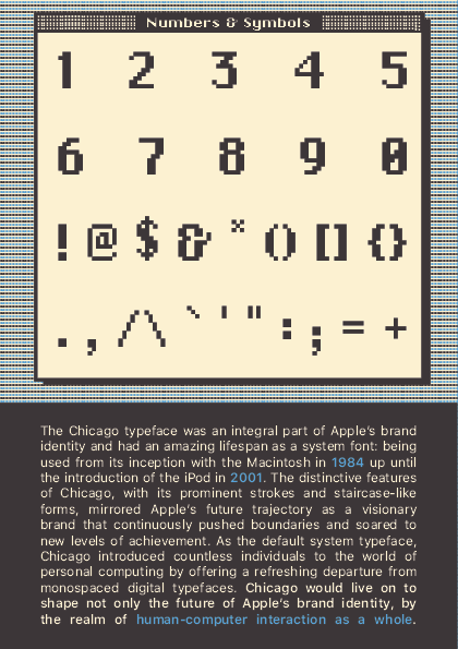
The Chicago typeface was an integral part of Apple's brand identity and had an amazing lifespan as a system font and was used from its inception with the Macintosh in 1984 up until the introduction of the iPod in 2001 (Letterforms Archive, 2020, 7:18). The distinctive features of Chicago, with its prominent strokes and staircase-like forms, mirrored Apple's future trajectory as a visionary brand that continuously pushed boundaries and soared to new levels of achievement (Brown, 2018). As the default system typeface, Chicago introduced countless individuals to the world of personal computing by offering a refreshing departure from monospaced digital typefaces (Robinson, 2020; Hintz, 2018, p. 54). Chicago would live on to shape not only the future of Apple’s brand identity, by the realm of human-computer interaction as a whole.
Welcome to Macintosh…
In 1984, a charming little beige box allowed for computers to smile back at us, accompanied by the iconic Chicago typeface that helped shape the Macintosh’s friendly identity. Designed by Susan Kare, this typeface became synonymous with the Macintosh operating system, leaving an indelible mark on Apple's identity as a pioneer in human-centric design.
According to Kare herself, the prevailing thought behind the Macintosh’s design was that there needed to be a more humanistic approach to computing (Letterform Archive, 2020, 2:05). Kare recalls the guiding principals being:
1. “Your mom could use it”
2. like arcade games - no manuals
3. friendly
(Letterform Archive, 2020, 7:30).
The Chicago font was a direct result of this human-centered design, Apple wanted something bold and inviting to act as their title, menu and system font (Hintz, 2018, p. 53). The typeface needed to be basic and easy to read while being stylish and eye-catching. Thankfully, the Macintosh introduced revolutionary software to the realm of digital design: unlocking the possibility for designers to create digital type with proportional spacing - a game-changing development that brought digital fonts closer to resembling those of traditional letterforms (Brown, 2018). Rather than forcing each character to fit into a predetermined rectangle, the font allows letters to use as much or as little space as needed.
That is not to say there were no constraints in the design process, however. Each character in the typeface needed to fit in a space of just 9 x 7 pixels, and, due to hardware limitations, had to be able to be displayed using only shades of pure black or pure white without the capacity for grey values in between (Robinson, 2020). As this was Kare’s first font, she decided lean in to the limiting factors to guide her design. By suppressing the lines to only ever being at horizontal, vertical or 45-degree angles, she way able to create an alphabet of distinguishable characters that boldly stood out from the commonly found monospaced styles on screen at the time (Brown, 2018).
The Chicago typeface was an integral part of Apple's brand identity and had an amazing lifespan as a system font and was used from its inception with the Macintosh in 1984 up until the introduction of the iPod in 2001 (Letterforms Archive, 2020, 7:18). The distinctive features of Chicago, with its prominent strokes and staircase-like forms, mirrored Apple's future trajectory as a visionary brand that continuously pushed boundaries and soared to new levels of achievement (Brown, 2018). As the default system typeface, Chicago introduced countless individuals to the world of personal computing by offering a refreshing departure from monospaced digital typefaces (Robinson, 2020; Hintz, 2018, p. 54). Chicago would live on to shape not only the future of Apple’s brand identity, by the realm of human-computer interaction as a whole.
𝗗𝗘𝗦𝗜𝗚𝗡𝗘𝗥 𝗣𝗥𝗢𝗙𝗜𝗟𝗘
Born in 1954, Susan Kare is a pioneer in graphic and typeface design who has shaped the way we interact with technology. From designing a suite of icons that have become synonymous with digital work (such as the iconic floppy-disk save and trashcan icons) to curating a significant portion of Apple’s distinctive font library (including but not limited to, Chicago, Geneva & New York), the impact of Kare’s design legacy is still felt to this day.
Growing up in Ithaca, New York, Kare was “the type of kid who always loved art” and always dreamed of becoming either a “fine artist or teacher” (Hintz, 2018, p. 49). Kare would go on to graduate with top honors, summa cum laude, from Mount Holyoke in 1975 with a B.A. in Art. Her dedication and passion would motivate her to pursue a M.A. and Ph.D in fine arts from New York University in 1978 with a doctoral dissertation on "the use of caricature in selected sculptures of Honoré Daumier and Claes Oldenburg".
Susan Kare's unwavering dedication to fine art has been a defining aspect of her career. Following her Ph.D., she found herself in San Francisco, working as a sculptor and occasional curator at the Fine Arts Museums of San Francisco. Despite her love for sculpture, Kare found the practice to be too solitary of a medium to pursue full-time (Hintz, 2018, p. 49).
In 1982, Kare received a phone call from old high school friend, Andy Hertzfeld who was now the Macintosh’s lead software architect. He invited her to consider interviewing for a graphic design role at Apple.
“By remaining friendly with Andy after high school, I knew he obviously was really interested in computers. He showed me a very rudimentary Macintosh, and mentioned that he needed some graphics for it. He knew I was interested in art and graphics, and that if I got some graph paper I could make small images out of the squares, which he could then transfer onto the computer screen. That sounded to me like a great project.” Interview with Susan Kare. Making the Macintosh. 2001 by Pang.
𝗧𝗬𝗣𝗘 𝗧𝗥𝗘𝗡𝗗𝗦
The influence of the Chicago 1984 typeface is an enduring feature in contemporary typography, with its distinct style permeating various applications, from logos to video games and beyond. The sans-serif font's versatile pixel-based design was notably adapted by Squaresoft for the English versions of their Super NES titles such as Final Fantasy VI and Chrono Trigger. Though Chicago was eventually retired, it would highlight the imperativeness of readability and personality in typefaces, heavily inspiring its modern-day spiritual successor, Charcoal (Brown, 2018).
Today's typography industry sees a revived interest in pixel and bitmap fonts—a trend that pays homage to the pioneering design of Chicago. The font's characteristic clear, blocky features are now increasingly sought after for their legibility and retro appeal, particularly in digital and screen-based design. Moreover, the qualities that Chicago embodied—simplicity, legibility, and distinctiveness—remain highly valued in contemporary typeface design. The font's design is uniquely tailored to perform well in digital contexts, highlighting the growing demand for typefaces that cater to the ubiquity of screens in our daily lives.
Chicago's influence extends beyond typography and delves into the realm of user interface design. The design principles behind Susan Kare's work on the Macintosh interface, including the use of the Chicago typeface, played a crucial role in making early Macintosh computers more user-friendly. Her design ethos continues to shape how we interact with technology today. Even though the use of the Chicago typeface itself may have declined, its core principles of clear, legible design continue to inspire modern typography, emphasizing that effective design is as much about functionality and user experience as it is about aesthetics (Hintz, 2018).
𝗙𝗬(𝘁)𝗜
Proportional spacing is a key concept in typography, the art and technique of arranging type to make written language legible, readable, and appealing when displayed. It pertains to the amount of space allocated to each character in a font, with each character potentially having a different width.
As stated in Chapter 6 of Typographic Design: Form and Communication, "too much or too little space between letters and words destroys the intended texture of a typeface" (Carter et al, 2012), disrupting its visual harmony. It is not difficult to understand why Chicago stood out so prominently against the proportional monospaced bitmaps of its contemporaries.
Inadequate spacing can compromise the legibility and overall aesthetics of a typeface, diminishing its impact and cohesiveness. However, Chicago’s deliberate attention to proper spacing allowed it to shine brilliantly amidst the monospaced bitmaps prevalent at the time.
𝗣𝗘𝗥𝗦𝗢𝗡𝗔𝗟 𝗥𝗘𝗙𝗟𝗘𝗖𝗧𝗜𝗢𝗡
Whilst the creation of this Zine was mandated for completion of a university unit, I was entirely enthralled by the prospect of making it! I have had a passion for Zines since attending my first NEXTDOOR ARI Zine fair here in Brisbane a few years ago, however I never found myself having the time to make one.
With this opportunity presenting itself, I wanted to make sure to endeavour to create something that I was proud of and that aligned itself with my own core values as a designer majoring in the field of human-computer interaction. I spent many weeks investigating typefaces, struggling to find the balance between a font I was passionate about, and one that had enough sources of information. When I discovered the incredible Susan Kare and her first font, Chicago, everything clicked: a designer who believes in a humanist approach to UI and enjoys incorporating levity in her work? Sign me up.
Through this project, I delved deep into the world of Susan Kare, the Chicago typeface, and typography in general. I learned about Kare’s remarkable contributions to graphic and typeface design, her role in shaping the early Macintosh interface, and her impact on user experience. Exploring the Chicago typeface, I discovered its significance as the first font proportionally spaced digital font, its role in shaping Apple’s brand identity, and its influence on contemporary typography.
Overall this project has fostered a deeper appreciation for the artistry and craftsmanship involved in typeface design within me, as well as highlighting importance of typography in shaping user interfaces and brand identities. I realized the power of type to convey meaning, evoke emotions, and create a cohesive visual language. Furthermore, I found myself relating quite heavily to Susan Kare, and studying her approach to human-computer interaction and emphasis on incorporating joy and personality into her designs has inspired me to infuse these elements into my own work. Thank you, Susan Kare, for your incredible contribution to the realm of interaction design - and thank you, reader, for coming along this typographic journey with me.
Overall this project has fostered a deeper appreciation for the artistry and craftsmanship involved in typeface design within me, as well as highlighting importance of typography in shaping user interfaces and brand identities. I realized the power of type to convey meaning, evoke emotions, and create a cohesive visual language. Furthermore, I found myself relating quite heavily to Susan Kare, and studying her approach to human-computer interaction and emphasis on incorporating joy and personality into her designs has inspired me to infuse these elements into my own work. Thank you, Susan Kare, for your incredible contribution to the realm of interaction design - and thank you, reader, for coming along this typographic journey with me.


Please note that this would be cut-out in the analog version, I have replicated a hole using layering to try and simulate what you would see in real life.


𝗥𝗘𝗙𝗘𝗥𝗘𝗡𝗖𝗘𝗦
Brown, E. N. (2018, September 28). Chicago: the Typeface. Chicagomag. https://www.chicagomag.com/city-life/September-2018/Chicago-the-Typeface/
Carter, R., Meggs, P. B. & Day, B. (2012). Typographic Design: Form and Communication, 5(pp. 111 - 124). Wiley & Sons. https://ebookcentral.proquest.com/lib/qut/detail.action?docID=697928.
Carter, R., Meggs, P. B. & Day, B. (2012). Typographic Design: Form and Communication, 5(pp. 111 - 124). Wiley & Sons. https://ebookcentral.proquest.com/lib/qut/detail.action?docID=697928.
Hintz, E. (2018). Susan Kare: Design Icon. IEEE Annals of the History of Computing, 40(2), pp. 48 - 61. 10.1109/MAHC.2018.022921443
Kinsey, C. (2019). Susan Kare. Communication Design: Design Pioneers, 26. https://research.library.kutztown.edu/cgi/viewcontent.cgi?article=1026&context=designpioneers
Letterform Archive. (2020, September 10). Notes on Icons and Design with Susan Kare [video]. YouTube. https://www.youtube.com/watch?v=4lx9Wtd2P48&t=1466s
Pang, A. S-K. (2001). Interview with Susan Kare. Making the Macintosh. https://web.stanford.edu/dept/SUL/sites/mac/primary/interviews/kare/trans.html
Robinson, R. (2020, April 10). The Chicago Typeface. North Carolina State University. https://go.distance.ncsu.edu/gd203/?p=54361#:~:text=This typeface was Chicago%2C a bitmap font with,monospace bitmap typefaces of computing at the time.
Walker, A. (2014, September, 18) Kern Your Enthusiasm: The Friendliness of Chicago. Slate. https://slate.com/culture/2014/09/chicago-typeface-apple-computer-font-made-for-macintosh-and-used-on-ipod-felt-friendly.html


